In the world of filmmaking, there is a distinct boundary between a “home video” and a “cinematic masterpiece.” While high-end cameras and lenses play a role, the real magic often happens in the post-production suite. This magic is called Cinematic Color Grading.
If you have ever wondered why Hollywood movies look so polished, moody, and immersive, the answer lies in how they manipulate color to tell a story. In this guide, we will dive deep into the fundamentals of color grading and how you can achieve a professional look for your projects.

1. What is Cinematic Color Grading?
Before we jump into the technicalities, it is essential to define what we mean by color grading. Many beginners confuse it with color correction, but they serve two very different purposes.
Color Correction vs. Color Grading
- Color Correction: This is the technical step. The goal is to make the footage look “normal” or exactly how the human eye saw it on set. This involves fixing exposure, balancing white balance, and ensuring that skin tones are accurate across all clips.
- Color Grading: This is the creative step. Once the footage is “corrected,” you apply a specific look to evoke an emotion or set a mood. Color grading is what gives a horror movie its cold, blue tint or a summer blockbuster its warm, golden glow.

2. The Psychology of Color in Film
Colors aren’t just aesthetic choices; they are emotional triggers. Understanding color theory is vital for any colorist.
- Red: Evokes passion, danger, anger, or intensity.
- Blue: Represents coldness, isolation, sadness, or futuristic themes.
- Yellow/Orange: Suggests warmth, happiness, nostalgia, or energy.
- Green: Can signify nature, sickness, or even something ominous (like the “Matrix” green).
By choosing a specific color palette, you are subconsciously telling your audience how to feel about a scene before a single line of dialogue is spoken.
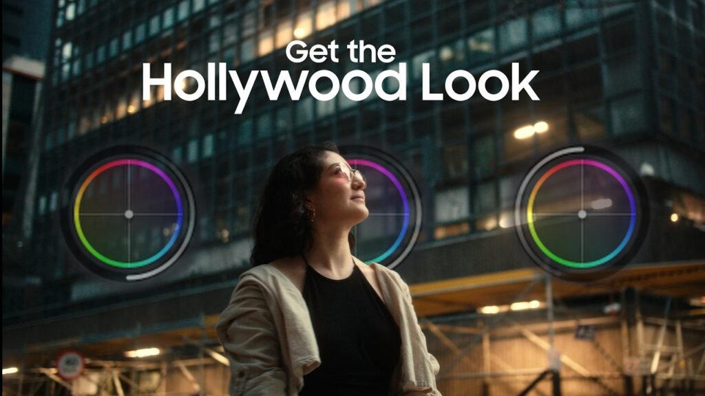
3. Essential Tools for Color Grading
To get started, you need the right software and tools. While most NLEs (Non-Linear Editors) have color tools, some are built specifically for this craft.
Top Software Picks:
- DaVinci Resolve: The industry gold standard. It offers the most advanced node-based grading system and is used by Hollywood professionals.
- Adobe Premiere Pro: Features the Lumetri Color panel, which is excellent for most content creators and integrates perfectly with the Creative Cloud.
- Final Cut Pro (FCPX): Known for its speed and intuitive color wheels and curves.
Hardware:
- Color Accurate Monitor: You cannot grade what you cannot see. Investing in a monitor with high sRGB or Rec.709 coverage is crucial.
- Control Surfaces: Professional colorists use panels like the DaVinci Resolve Micro Panel to have tactile control over shadows, midtones, and highlights.
4. Understanding the Technical Fundamentals
To achieve a cinematic look, you must master the three pillars of color manipulation:
The Color Wheels (Lift, Gamma, Gain)
- Lift (Shadows): Controls the darkest parts of your image. Crushing the blacks slightly can add drama, but lifting them can create a “filmic” or faded look.
- Gamma (Midtones): This is where most of your image lives, including skin tones. Adjusting gamma changes the overall brightness without clipping the whites or blacks.
- Gain (Highlights): Controls the brightest parts of the image, like the sky or light sources.
Saturation and Contrast
Cinematic footage rarely looks “neon” or over-saturated. Often, filmmakers desaturate certain colors to make the image feel more grounded and sophisticated. Contrast, on the other hand, adds depth and makes the subject “pop” from the background.
5. The “Teal and Orange” Secret
If you look at modern cinema, you will notice a recurring theme: orange skin tones against a teal (blue-green) background.
Why does this work? Orange and Teal sit directly opposite each other on the color wheel. This creates complementary contrast, which is naturally pleasing to the eye. Since human skin is naturally in the orange/red spectrum, making the shadows and backgrounds blue/teal makes the actors stand out vividly.
6. A Step-by-Step Workflow for Cinematic Grading
Follow this workflow to ensure a clean and professional result:
- Shoot in LOG: If your camera supports it, shoot in a logarithmic profile (like S-Log, V-Log, or C-Log). This captures the maximum dynamic range, giving you more “data” to work with in post.
- Primary Correction: Adjust your exposure and white balance first. Use Scopes (Waveform and Parade) to ensure your levels are legal and balanced.
- Match Your Clips: Ensure that every shot in a scene looks consistent. You don’t want the color to jump when you cut from one actor to another.
- Apply Your Look: This is where you add your creative grade. You can use LUTs (Look Up Tables) as a starting point, but always tweak them to fit your specific lighting.
- Secondary Grading: Isolate specific areas. For example, use a mask to brighten the eyes of an actor or change the color of a specific car in the background.
- Final Polish: Add a subtle film grain or a slight vignette to draw the viewer’s eye toward the center of the frame.

7. Common Pitfalls to Avoid
- Over-Grading: Beginners often push colors too far, leading to “noise” or “banding” in the image.
- Ignoring Skin Tones: If your sky looks great but your actor looks like a zombie, the grade has failed. Always prioritize natural-looking skin.
- Not Calibrating Your Screen: If your monitor is too warm, your final video will look too blue on everyone else’s screen.
Conclusion
Cinematic color grading is a bridge between reality and imagination. It transforms a digital recording into an emotional experience. Start by mastering the basics of color correction, experiment with different moods, and always keep the story in mind.
Whether you are editing a YouTube vlog or an indie short film, the right colors will make your audience stay engaged and mesmerized.